My Roles – Lead UI/UX Designer for uAttend team
Research and Wireframing
UI/UX Design
Icon Design
Implementing an on-boarding setup had a significant impact on new customers. After this feature went live, customer support saw a 90% reduction in these types of calls! With some of those calls lasting over a hour, it dramatically reduced the time spent on the phone.
Project Description
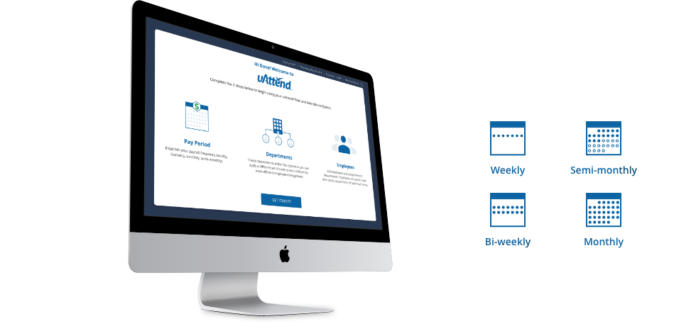
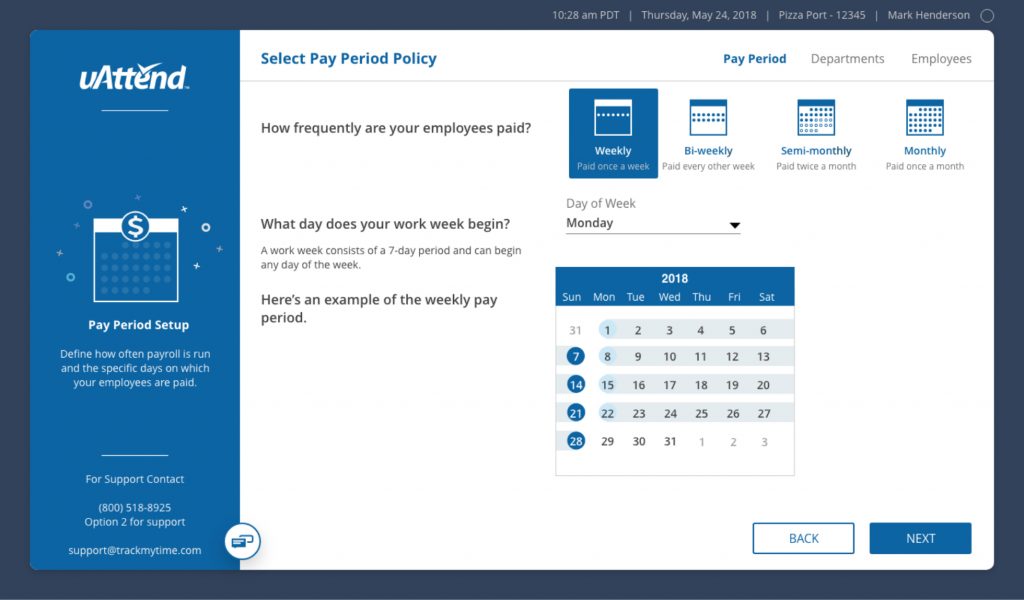
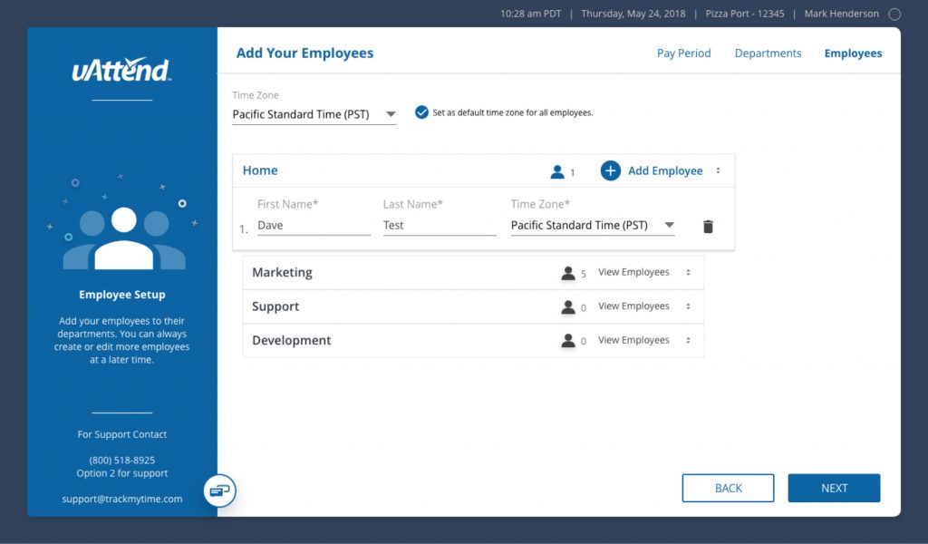
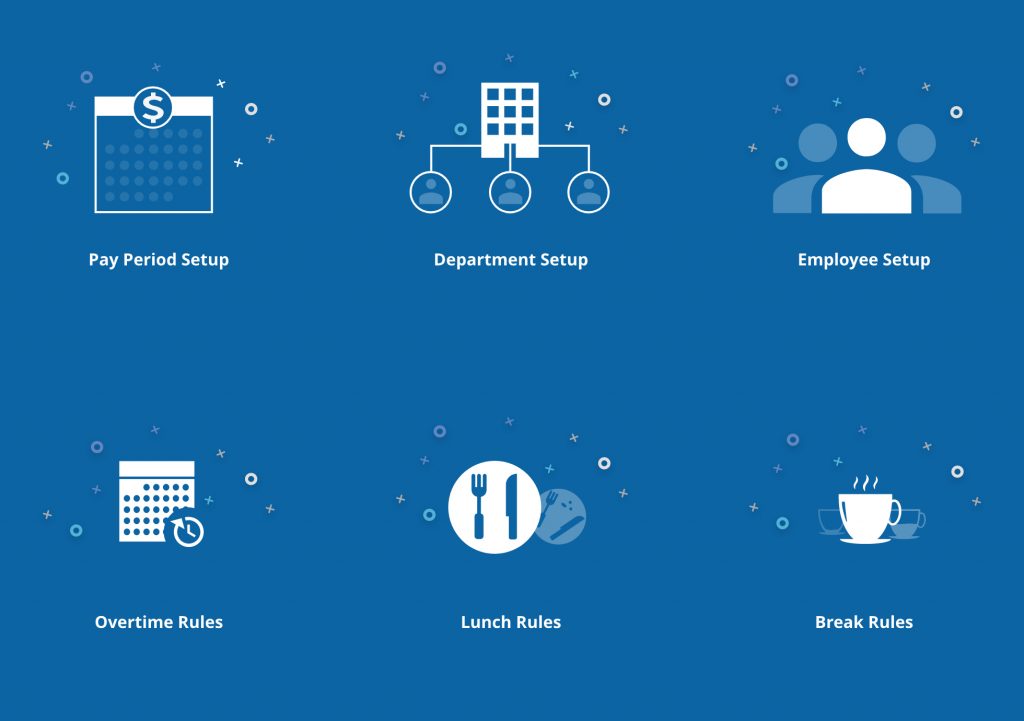
uAttend is a cloud-based system that saves businesses time and money by automating time and attendance management. The web portal onboarding allows new account users to set up their pay period, departments, and employees. Within seconds, administrators can configure their unique settings for overtime, break, and lunch rules.
Problem
There was no step-by-step guide to assist users in setting up their product in the web portal. Users would sign up, log in to their account, and have difficulty configuring their business settings. They would then call customer support and spend an hour on the phone with a service technician. Not only did it consume our user’s time, but it also would bog down our support team.
Research and Analysis
Goal
Implement a way to improve the time it took for administrators to set up the business on their new account.
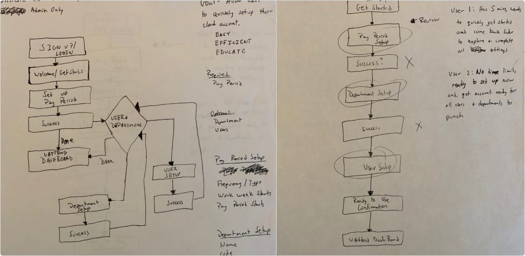
Admin Onboarding Flow
Challenges and Pain Points
- Users may have many employees spread across multiple departments.
- Employees need to be added AND assigned to departments.
- Some users have simple setup while others have advanced policies and rules.
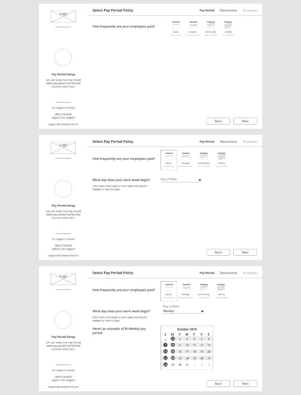
Wireframes
I initially started with a step-by-step flow, with 1 question per screen. The goal was to keep the user focused on one question at a time before moving on to the next question.
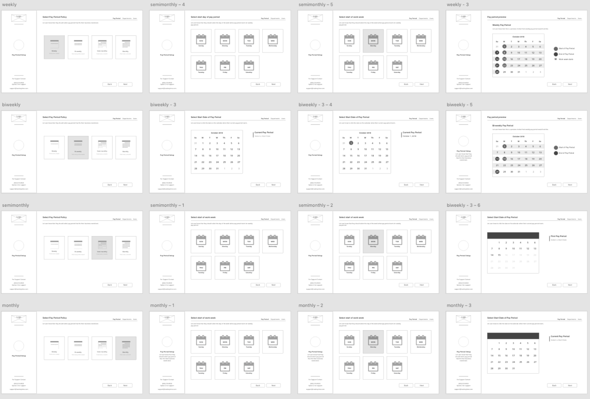
Because of testing and implementation on a similar product, it was clear that with additional clicks, this flow took to long for users to complete. We decided to still ask one question at a time but keep all questions on the same page. As a result, users could now quickly review and edit what they selected without having to go back through the flow.
Another challenge of this onboarding feature was assigning employees to the department. User research found that our customers average 5 departments and 20 employees. With this knowledge, we decided to proceed to go with a collapsing view of departments where employees could be quickly added and assigned at the same time. Another factor that contributed to this decision was using this method in the on-boarding of a similar product. The list and dashboard setup flows would work best if customers had many more departments or employees.
Setting up pay period, departments, and employees are required to initially setup. After that, some businesses will have rules to establish while others would want to start using the product. To solve this, a transition screen was needed.
The transition screen idea allowed customers that were done with the setup to move on and explore the product. If an administrator still needed to set up rules, they could do that too.
Completed High Fidelity Screens
The Impact
In summary, implementing an onboarding setup had a significant impact on new customers. They can now quickly establish the business in their account and move on to another part of their busy schedules. After this feature went live, customer support saw a 90% reduction in these types of calls! With some of those calls lasting over an hour, it dramatically reduced the time spent on the phone. This allowed our support team to focus their attention on more customers in a shorter amount of time.